interactions between the various mechanics in the games likely yield countless surprises, and let you build something considerably more elaborate than thesum of its parts..
The Puzzle Boy / Kwirk series of games is Sokoban-based, but has 3 different mechanics on top of that: turnstiles, pits (that can be filled by blocks), and blocks larger than 1x1. One of the things I love about it is that, each mechanic is interesting on its own, and each combination of mechanics results in levels with very different feels. Lots of puzzles with a bunch of mechanics try to throw tons of them into each level, and each level ends up feeling very samey. But judicious use of combinations can lead to a lot of interesting variety.
Puzzle design is his strong point (and the team has several v. good puzzle designers on it), so it's safe to assume there'll be some good ones there. The sheer quantity make me wonder about how the game will be structured - they can't presumably all be stumpers (aka hard puzzles that you'll have to step back from and think about) - maybe there'll be more of a gentle flow between puzzles, like in the Witness, or maybe there'll be lots of optional levels/branching in the game design. I guess we'll see! I'm curious :)
>Trying to optimize to some kind of perfect pixel alignment shouldn't be a goal anymore.
If you're trying to display pixel art (or make games with pixel art), being able to have integral upsizing is very useful. Antialiasing doesn't cut it, and the eye notices when you do non-integral nearest-neighbour upscaling and some pixels are the wrong size.
Huh (having scanned but not read in detail the post), interesting approach. I'm not that well-versed in this area (as a game developer, I tend to jump straight to nearest-neighbour), but hadn't come across this before. I love the pathological example of a checkerboard pattern - very pleasing worst-case scenario, where I suspect it would just be a grey blur. However, the developer doesn't show us the equivalent for the suggested filter - systemically showing side-by-side comparisons of different filters would be useful. I suspect the resulting artefacts would be randomly blurry lines, which could also stand out. But nice to see people thinking about these things...
Here's a related disucssion on what 'pixelated' should mean from the css working group
(every so often browsers break/rename how nearest-neighbouring filtering works. I hope at some point it stabilizes lol - I note in the discussion linked nobody else cares about backwards compatibility ...).
> It had horrible subs because the sub were written by Chinese people using Chinese names for places and character
More likely the translators, probably native English speakers, intentionally decided to use 'authentic', 'historical' Chinese names (as modern mandarn speakers would write them in pinyin) rather than the Japanese ones?
I agree that the effect could be really confusing though, and it's not what I would do!
(IIRC the fan translations of the Manga also gradually decided to change to use Chinese versions of the historical names, which I also found confusing - especially as they have kept some of the old Japanese names ones, so...it's a weird mix...)
Kingdom at least has some connection to historical places/people so it kind of makes sense.
Thunderbolt Fantasy on the other hand is completely original/fictional in setting and characters, and yet still uses the Chinese names in the subtitles. While it is a joint Taiwanese-Japanese project, the only available audio is Japanese. So none of the completely made up names ever match between audio and subtitles.
And then there's Dragon Ball with e.g. Son Goku who is named after the Monkey King from Journey to the West but nobody ever refers to him as Sun Wukong.
Yeah, I remember a friend getting a call during coworking and her face just went white, and after the call she told us that was the tax people calling about irregularities (she had moved countries and was slow in sorting out her tax situation), and we all bought it - there was no sober "oh yeah it's a scam" advice from us - it was really perfectly timed, and took a day or to for her to reason through that it must be a scam. (No money lost though!)
>Moreover, with Han Unification it strayed from its core mission to "encode all characters needed for written communication in the world" (emphasis mine).
Why do you say that? Because Unicode now has become balkanised between various CJK regions?
Because it conflates distinct characters and therefore fails its original mission to encode all characters needed for written communication.
Han Unification is just the most obvious case but the issues do not stop there. I'll give you a
western example. In the sentence
«Günther a souligné l’ambigüité de son discours.»
there is an umlaut and a dieresis.
They are different things with different function. In traditional book printing they used to look differently.
With Unicode all this cultural nuance is lost. The characters necessary to communicate precisely simply have never been encoded, because Unicode forgot about its core mission.
Fixing things like that is where I want to see efforts go.
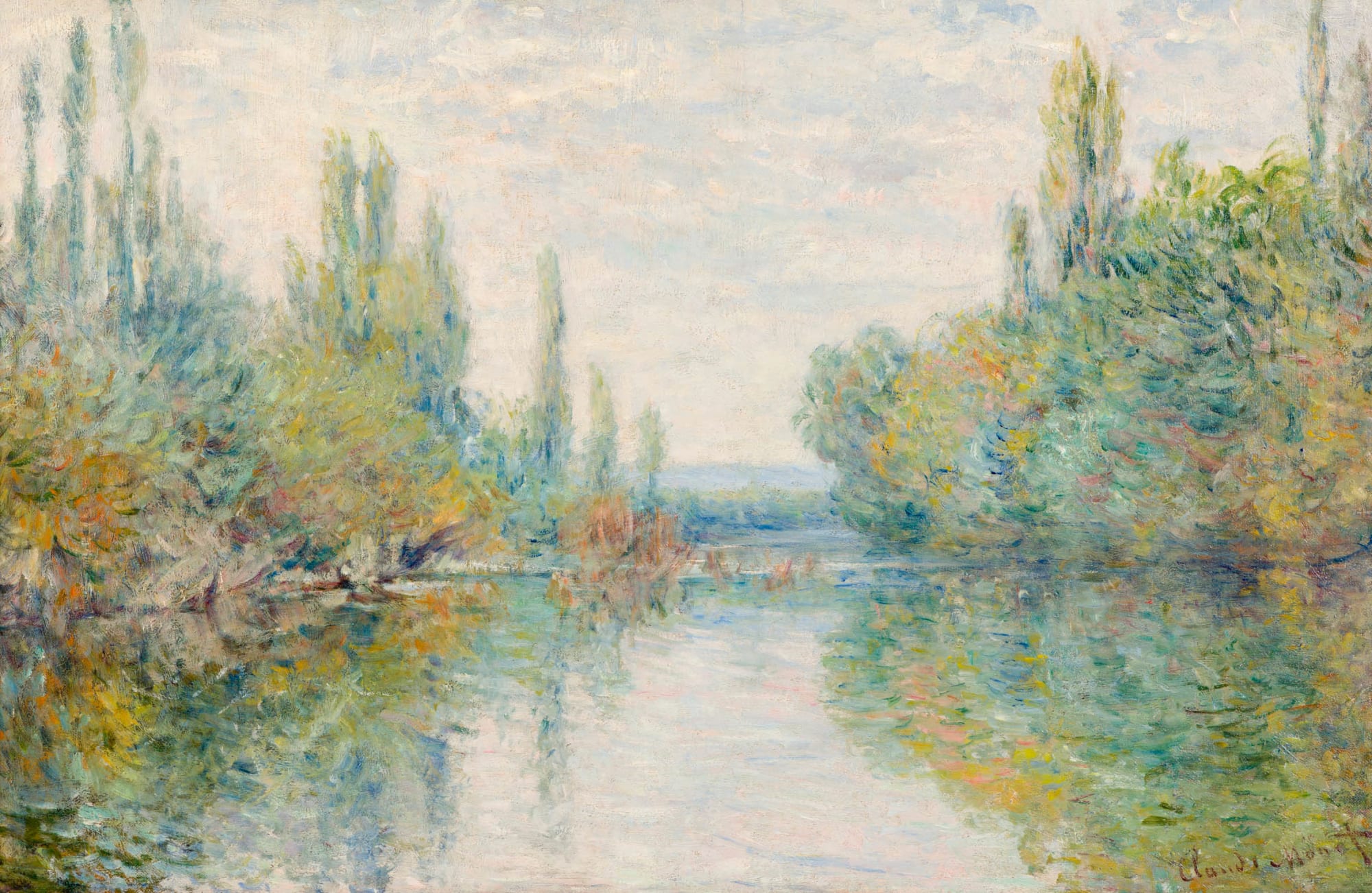
The problem I personally have with the Zelda example given is that it looks really bland to me - the landscape looks really washed out - the author says "Somebody would paint this. It’s artistic.", but I don't think anyone would paint with such bleached-out colours.
In the painting there's a delicate interrelation between colours - you have browns/greens/blues in the dark parts, and more whites/yellows/blues/pinks in the light parts. I wouldn't describe it as bland, though it is in a sense washed-out. BotW doesn't, and probably can't have that level of handling of shades colour in the enviroment graphics if nothign else because of the technical constraints of the Switch hardware.
Looking at the screenshot, what can you say - you can say that it's nice that the green/yellow of the sky is mirrored in the green landcape with yellow rivers. And the back-lighting of the sun is helping give definition to some of the mountains/hills, which is nice. But I don't see very much subtle going on with the landscape.
Looking at the art, you can see a lot more dynamic range, clearer silhouetting of mountain ranges at various distances, whereas the actual game is more monotone-green. You can also see the fog doing a lot more work of making the shape of the land clear. There are some bits of fog/mist in the screenshot as well, but they're not doing as much heavy lifting in terms of giving shape to the landscape.
The Switch is really limited on the hardware front, and I can't imagine what kind of trade-offs the art team had to make to get to where they are - it's a very difficult balancing act that I only understand a small part of. Nintendo also tend to be very conservative/restrained in their 3d style (I remember being somewhat unnerved by Ubisoft's "Mario + Rabbids Kingdom Battle" Mario game, because it went super high-production-quality).
It feels a bit cheap to give as an example, but the 3D MMO Love by eskil steenberg tried to emulate the impressionist style, and did a striking job:
https://imgur.com/9U18eRZ
The bloom effect is doing a lot of heavy lifting to make the bright colours pop, but even in the less glowy areas there is quite subtle layering of colours going on and one does have the feeling that the colours are playing with eachother.
( https://www.youtube.com/watch?v=Cc02ijaw-Tg a video of it in action, if you are curious ).
As another comparison, looking at elden ring you can see they've gotten 'using fog to make landscape silhouettes pop' down to a fine-art (maybe they're even over-reliant on it)
https://imgur.com/a/5GEePwL
And looking at the landscape you have really nice looking brown/oranges in the fields in the foreground, black/greys/browns in the mid-ground, rocky cliffs, fog is actually glowing, and you have some green forests in the top-left. That's a lot of nuance for what's essentially a brown landscape. BoTW doesn't have that - would it have it if the team had the hardware capabilities and time and budget? Who knows...
http://number-none.com/blow/prototypes/index.html
It's very different from his more recent stuff, but charming.